Well-Beings - brand identity
An identity design journey from ideation to living brand for a unique wellness collective and co-working center.
Scroll ↓

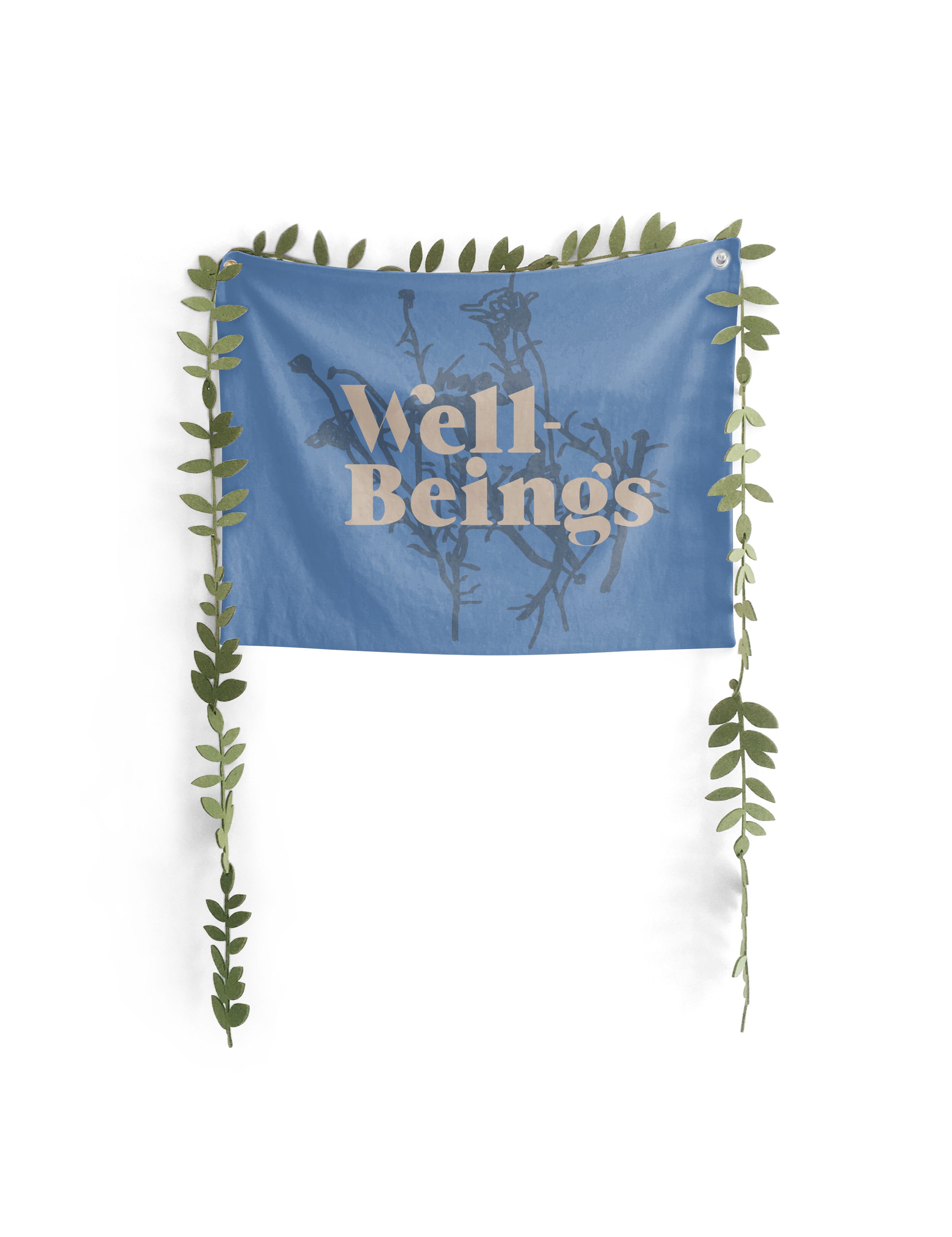
Take a deep breath…
…and exhale.
Problem Statement
Well-beings presents a uniquely holistic health and wellness treatment offering to market. The brand’s new identity must reflect the calming authority of a wellness center, the building and its particular sense of place, the retro styling, and the varied medicinal specializations of the collective members.
The “Why”
This multidisciplinary co-working healthcare wellness space and collective offers holistic treatment for patients of all ages, as well as transparency in rent at subsidized cost in an expensive city. Their belief in holistic wellness is apparent throughout all aspects of the collective.
The architectural features of their renovated boutique hotel building, and the collective’s abundance of plant life, also lent heavily to the brand direction. My clients had specific artworks in mind for reference in building out brand elements, as they had a growing collection that would be featured in the space. The “West Coast” feeling was important to the soul of the brand, so I took inspiration from vintage typefaces and patterns, throwback style, natural textures and materials.
Preliminary Research
Preliminary Research
I began with an audit of competitor wellness centers in the Yaletown area.


-
First, I examined Yaletown Wellness’ logo and website. Their brand is what I would consider the archetypal or generic wellness center style. Their logo is clean and modern, and incorporates calming and visually appealing foliage elements. Their colors are grounded and calming, and lean towards invigorating. Their website incorporates the typical imagery - not particularly interesting lighting for botanical elements, some staged photos off the staff with busy environmental light, and the content is typical of a wellness center. Everything comes across as fine, but not particularly exciting; safe and familiar.
-
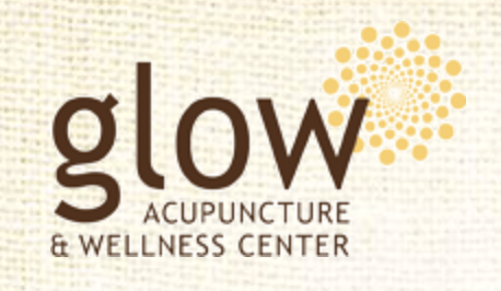
Then I looked at Glow Acupuncture & Wellness Center. Their logo again is very modern, incorporating sacred geometry, earth tones, and is seen on a burlap or natural fabric background on their website. The website is simple, with easy user interface, but looks very out of date due to the scale of the container element, the pixellated background, and the lack of engaging and rewarding user interaction opportunities. It’s simple, with a clean logo, but does not feel of this time or forward-thinking, in that it does not engage people.
-
Finally, I audited The IV Health Centre. Again, this business’ logo is super clean, very easy to read and translate to multiple applications, since it is one color. But that simplicity comes at the loss of personality and personal connection for the brand, giving the user a corporate or more medical interaction. This communicates authority and professionalism, but it does not equate to personality or personal connection.

The research led me to the following preliminary design choices. Per client conversations, plants and natural and architectural features would be paramount in the brand’s stylization. I began with pulling creative commons imagery from Unsplash to start painting an image of the brand at a glance. I took into consideration elements and how they would relate to the real-world environment.
The big idea is holistic wellness, and to adequately define the brand, I needed to address the real-life implications and drive that experience to best suit all users. Natural light (like in the business lounge), transparency (as in lots of windows), white space (breathing room in the building, and the time to breathe in therapeutic practice), natural-inspired colors that stand out against the neutrals (real plant life, wellness manifesting through practice, holistic health stemming from the mundane).
Brand Identity
Brand Identity
These elements are the basis for connecting Well-Beings health professionals to their clients. Expand to read more.
-
Included on the board are natural untreated wood, concrete, and flat white paint. There are many spaces for pause among the dense information, transparencies allowing for a continuous experience. I used the board to begin to hammer out the tangible feeling of the brand at every experience touchpoint through materials, physical space, typography, plant life, and color themes.
For typographic solutions, I began with “bold and clean, establishing the collective as authorities in their respective fields, professional as well as caring and fun.” This basis and the collective’s retro interests led me to a few possibilities for type solutions for the original considerations. I ended up creating a hybrid of Grumpy typeface tracked out with a little more fun visual interest by blending weights and utilizing floating ascenders. More on type below.
Also included in the board are some Header and Body copy type solutions, tertiary colors, and ideas for photo overlays in marketing. These elements were included to inspire the collective to take some risks and explore their own personalities, while still being able to count on a design language that will work for the brand as a whole. This display takes the ground-up thinking out of the equation and allows the collective to do what it does best.
-
An abundance of natural light streams through the windows of a historic building in the hip spot of Yaletown, B.C. This is the setting for Well-Beings, a holistic health collective, featuring multidisciplinary health and therapeutic professionals.
There are up-sides and some not-so-great features of the locale for a new business. Positives include those beautiful windows, easy street access, and a variety of immediate display options to pull in guests.
But with those pro’s come some issues. Namely, the biggest negative of being part of a larger stylized building, is the similarity of each shop from the outside of the building.
Thus, the importance of the plant life (maybe a little less than the plant shop pictured), and the inclusion of beautiful natural-feeling art by Carlos Colin.
This sandwich board (and other art) by Carlos Colin were integral to the design process. The artist is a close friend of people in the collective, and they intended to show his work in the building, as well as commission a special one-of-a-kind sandwich board for the sidewalk outside the collective, to draw people in. Since this would be a very important interactive point on the user journey, I played off the bold lines and retro color scheme and the natural and exposed elements in my design iterations.
-
The main logotype is based loosely on Grumpy typeface. Here’s some of its history from Typewolf: ”
Grumpy is a heavy, high-contrast serif typeface designed by Tomi Haaparanta and released through Suomi Type Foundry in 2011. The design of Grumpy was inspired by ITC Grouch, a typeface that was originally adapted from the heavier weights of Caslon. Grumpy contains six optical variants with over 2000 hand-adjusted kerning pairs to give it that “tight, not touching” style that was popular in the 1970s.”
Retro type headlines with easy to read and calming body copy. This was the general guiding principle I stuck to. I presented three sets of Header and Body copy type solutions to take the ground-up thinking out of the equation and allow Well-Beings to communicate. consistency across platforms. -
Since Well-Beings is such a unique offering to a well-established industry, I needed to bridge the logo and brand elements to the familiarity of imagery present in the industry. I went straight to the ideal of botanical or floral elements, but not done in the same computer-graphics clean style that is typically seen in the segment. Holistic health and continuous improvement, but coming from a place of humanity, of liveliness, of real experiences.
This drove my thinking and iterating towards hand-drawn botanicals elements. I landed on a very rough sketch of flowers with long stems reaching out like a yoga class, to subtly communicate a group acting as a whole towards wellness goals.
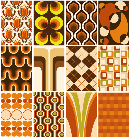
For elements to pair with the type, I looked to vintage signage and bold graphic elements reminiscent of mid-century designs through the 70’s. With these, I leaned into shapes and forms as bold visual conversation-starters.
I looked to patterns and bold graphical elements from the 50’s through 70’s, as well as Colin’s work, for inspiration. This led to large graphic elements, including sputnik- or rays-style motifs, thick botanicals, and circles/moons/cyclical motifs.

Inspiration
Inspiration


Iteration
Iteration




The Logo Suite
The Logo Suite
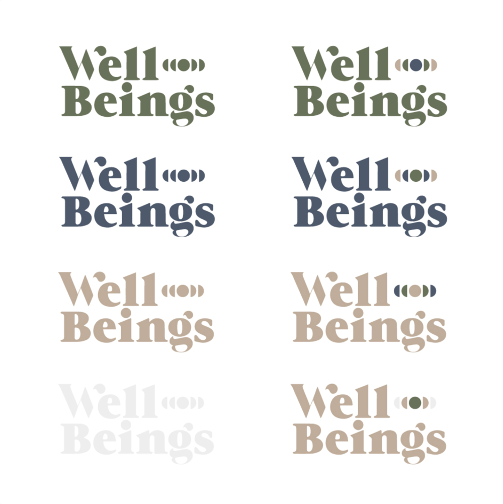
In the final deliverables, I included multiple versions of the logo, which will allow the brand to adapt it to suit particular needs as they arise. The final logo kit had to communicate multiple aspects of a multidisciplinary team to a public who may not know what to expect when they pass it on the sidewalk outside a beautifully-renovated historic building. Adding outside elements consistent with the brand direction board brings in new guests by informing them and presenting a unique offering.

The logo is a fluid and malleable brand element, and at every touchpoint a brand interaction can be encouraged through these changes.
This bridges the gap and meets the consumer where they are, every time.



Retrospective
Retrospective
The problem we solved: a new holistic health and wellness center was in need of a brand identity that spoke to the calming authority of a wellness center, the building and its particular sense of place, the retro style preferences of the collective, and the varied medicinal specializations of the collective members.
Who we worked with and brought solutions to: the collective of health and therapy professionals, who all have varied interests and preferences but a common goal of holistic health. The brand identity side was orchestrated solely by myself, but with input from the collective throughout, to best serve their needs.

Toolbox
I did simple research through Google searches and on competitors’ websites. Design ideation was done digitally for typographic solutions, and digitally with a Wacom tablet for drawing the botanical elements. I found color inspiration from retro design and in natural materials. I put together the logo kit in Adobe Illustrator.